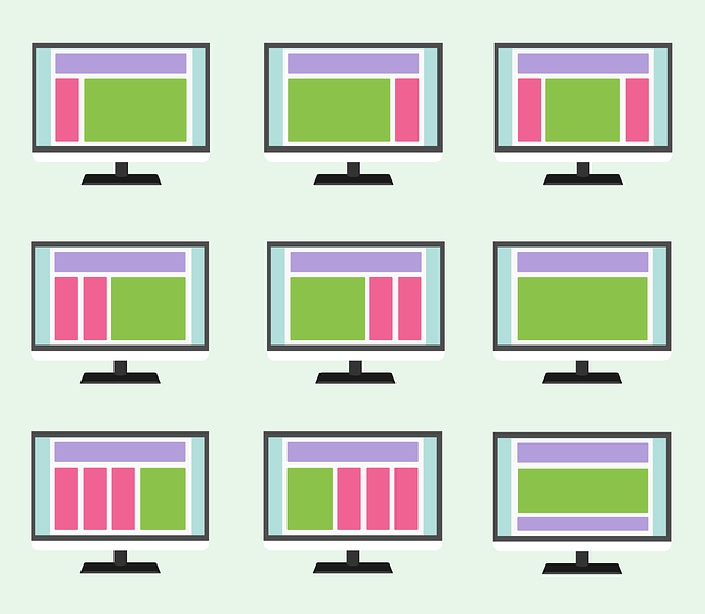
I was recently building a set of pages, that I needed to be able to switch what was displayed based on whether I was on a Desktop or Mobile device. On a Mobile device I would change the layout of tables or limit certain features in order to provide a better experience on mobile. I created a few simple components to aid in this.
import { Component, OnInit } from '@angular/core';

@Component({
  selector: 'app-page-content',
  template: `<ng-content></ng-content>`,
  styleUrls: ['./page-content.component.scss']
})
export class PageContentComponent implements OnInit {

  constructor() { }

  ngOnInit(): void {
  }

}
This would create wrapper for <app-page-content></app-page-content>. The content would be display on any page regardless of mobile or desktop.
import { Component, OnInit } from '@angular/core';

@Component({
  selector: 'app-page-content-desktop',
  template: `<ng-content></ng-content>`,
  styleUrls: ['./page-content-desktop.component.scss']
})
export class PageContentDesktopComponent implements OnInit {

  constructor() { }

  ngOnInit(): void {
  }

}
This is a wrapper for <app-page-content-desktop></app-page-content-desktop>. This content would only be displayed on a Desktop device.
import { Component, OnInit } from '@angular/core';

@Component({
  selector: 'app-page-content-mobile',
  template: `<ng-content></ng-content>`,
  styleUrls: ['./page-content-mobile.component.scss']
})
export class PageContentMobileComponent implements OnInit {

  constructor() { }

  ngOnInit(): void {
  }

}
Big surprise another wrapper for <app-page-content-mobile></app-page-content-mobile>. This is only shown on a mobile device.
import { Component, OnInit } from '@angular/core';

@Component({
  selector: 'app-page-actions',
  template: `<ng-content></ng-content>`,
  styleUrls: ['./page-actions.component.scss']
})
export class PageActionsComponent implements OnInit {
  constructor() { }
  ngOnInit(): void {
  }
}
Now I need to have a consistent set of controls at the top of may page. I created this wrapper here for <app-page-actions></app-page-actions>. This would hold my actions I want to provide for the page.
import {Component, Input} from '@angular/core';

@Component({
    selector: 'app-page',
    templateUrl: './page.component.html',
    styleUrls: ['./page.component.scss']
})
export class PageComponent {
    @Input('title') title: string;
    @Input('icon') icon: string;

    constructor() {
    }
}
Now all of this came together for page-component.ts file that provide the <app-page></app-page> wrapper. All the other wrappers were child inside of this wrapper. This was the brains of the set of components that would decide where to place all of the children components and when.
Notice I had it taking a page title, and an angular material icon to display on the page.
.grid-container {
  margin: 20px;
}

.dashboard-card {
  position: absolute;
  top: 15px;
  left: 15px;
  right: 15px;
  bottom: 15px;
}

.more-button {
  position: absolute;
  top: 5px;
  right: 10px;
}

.dashboard-card-content {
  text-align: center;
}

.dashboard-controls {
  float: right;
}
Styling was pretty simple. Keep things simple and consistent look between all pages.
<div class="grid-container">
    <h1 class="mat-h1">
        <mat-icon class="material-icons color_standout  menu-card-icon">{{icon}}</mat-icon>
        {{title}}
        <div class="dashboard-controls">
            <ng-content select="app-page-actions"></ng-content>
        </div>
    </h1>
    <ng-content select="app-page-content"></ng-content>
    <ng-content select="app-page-content-desktop" *onSize="['xl','lg','md']"></ng-content>
    <ng-content select="app-page-content-mobile" *onSize="['xs','sm']"></ng-content>
</div>
Here is the HTML that assembles all the pieces together to create your layout for Desktop v’s Mobile. Now take notice I am using my *onSize here to switch to desktop on md, lg, and xl screen sizes, this for mobile xs, and sm.
Usage of this would be like the following:
<app-page>
     <app-page-actions>
          <p>My Actions</p>
     </app-page-actions>
     <app-page-content>
          <p>Shown on all devices</p>
     </app-page-content>
     <app-page-content-desktop>
          <p>Shown on all desktop</p>
     </app-page-content-desktop>
     <app-page-content-mobile>
          <p>Shown on all desktop</p>
     </app-page-content-mobile>
</app-page>